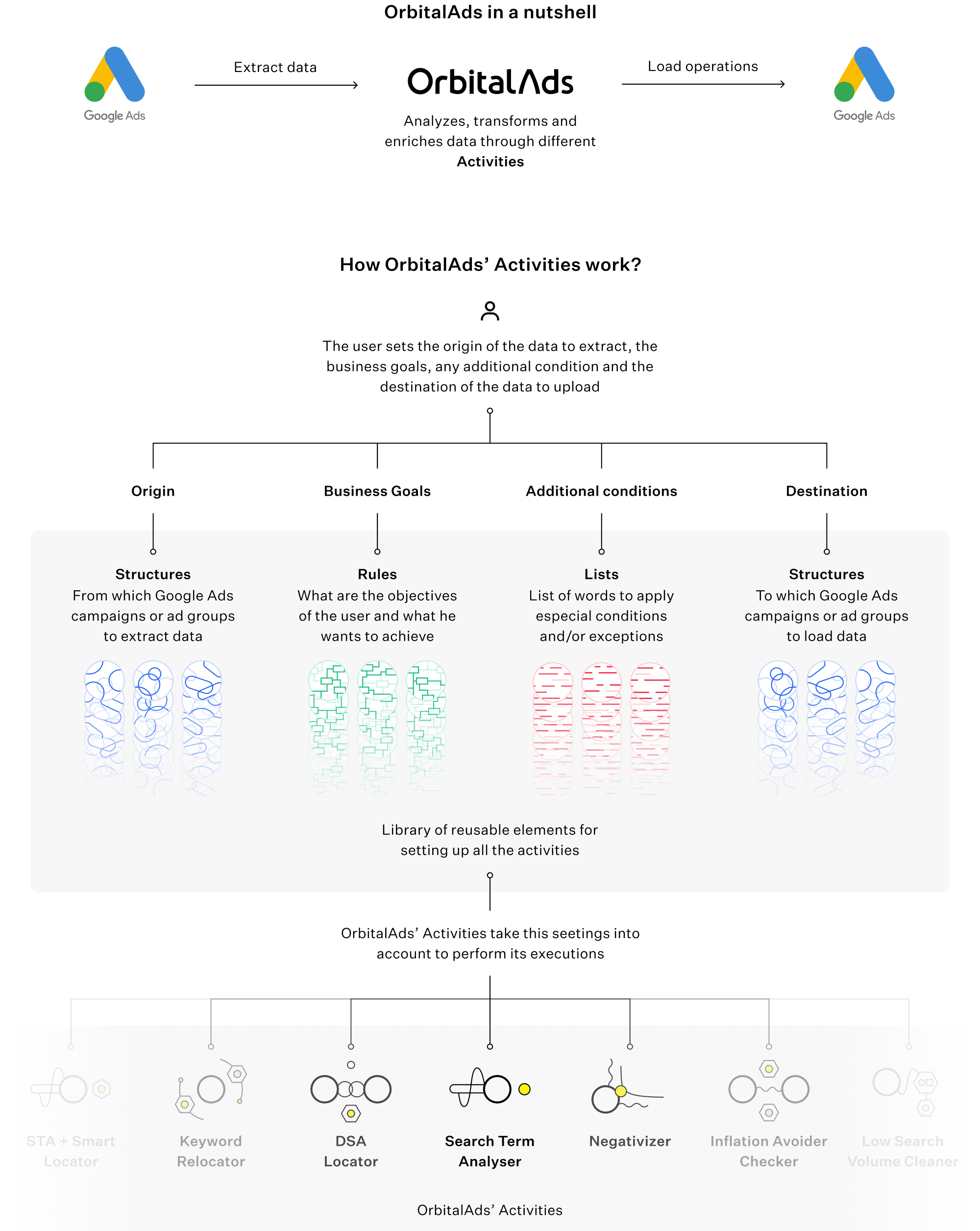
OrbitalAds is a SaaS startup that applies Artificial Intelligence and Machine Learning to Keyword Management in GoogleAds. Its objective is to improve the performance of the GoogleAds account and paid Ad Campaigns while saving time to SEM managers.
OrbitalAds needed to launch the interface for its product from scratch. The challenge was to create an entirely complex new app focused on a very specific user niche adding a layer of complexity to the already overwhelming Keyword Management process inside GoogleAds interface. That challenge had to be done inside a startup environment, with high levels of uncertainty and the need of having a lean and agile mindset so the product could be tested and validated as soon as possible with real users.
My role in this project was Design Lead. I managed a team of four junior designers with a hands-on approach.
I not only established design processes and know-how in the company and managed the growth of the design team, but I’ve also been involved in all the design stages of the project at the same time. From user research and test to prototyping, ideation, writing or final specifications for developers.

From the beginning, it was clear that, due to the fast-changing product, we were going to have a considerable benefit from having a basic design system in place. We needed to be very fast and effective testing different iterations of the product. Hence, the objective was to make it as simple as possible even though we knew the product was going to have a lot of complexity. Besides that, our users were heavy users of GoogleAds and were very familiarised with Material Design. Because of those reasons, we established Material Design as our foundation, from which we built any customisation needed on top of it.
From user research, we learnt that our users only use tablets or computers to work and manage GoogleAds due to the amount of data they manage. That’s why our interface and design system were not prepared for small screen sizes at the beginning. The app was optimised for desktop and big tablets screen sizes, which allowed us to be faster since we didn’t need to take care of so much responsiveness.
Since OrbitalAds activities happen with a different frequency—from daily to monthly or even punctually—the main screen of the interface features a timeline showing all the executions in the account.
The decision of making the timeline the main view versus a dashboard showing different metrics of the account was made for two reasons. First, our users valued more, in everyday use, the information and knowledge they had from this screen over the metrics we showed in the dashboard. Second, we discovered that the users spent very few time in the initial dashboard we had in place as the main screen to go to directly to the timeline, the most viewed screen in our interface.
From the Log screen, the user is able to go to the details of every execution to check all its relevant information and results and make decisions when needed. Inside each execution, all the details about the activity are shown as can be seen below.
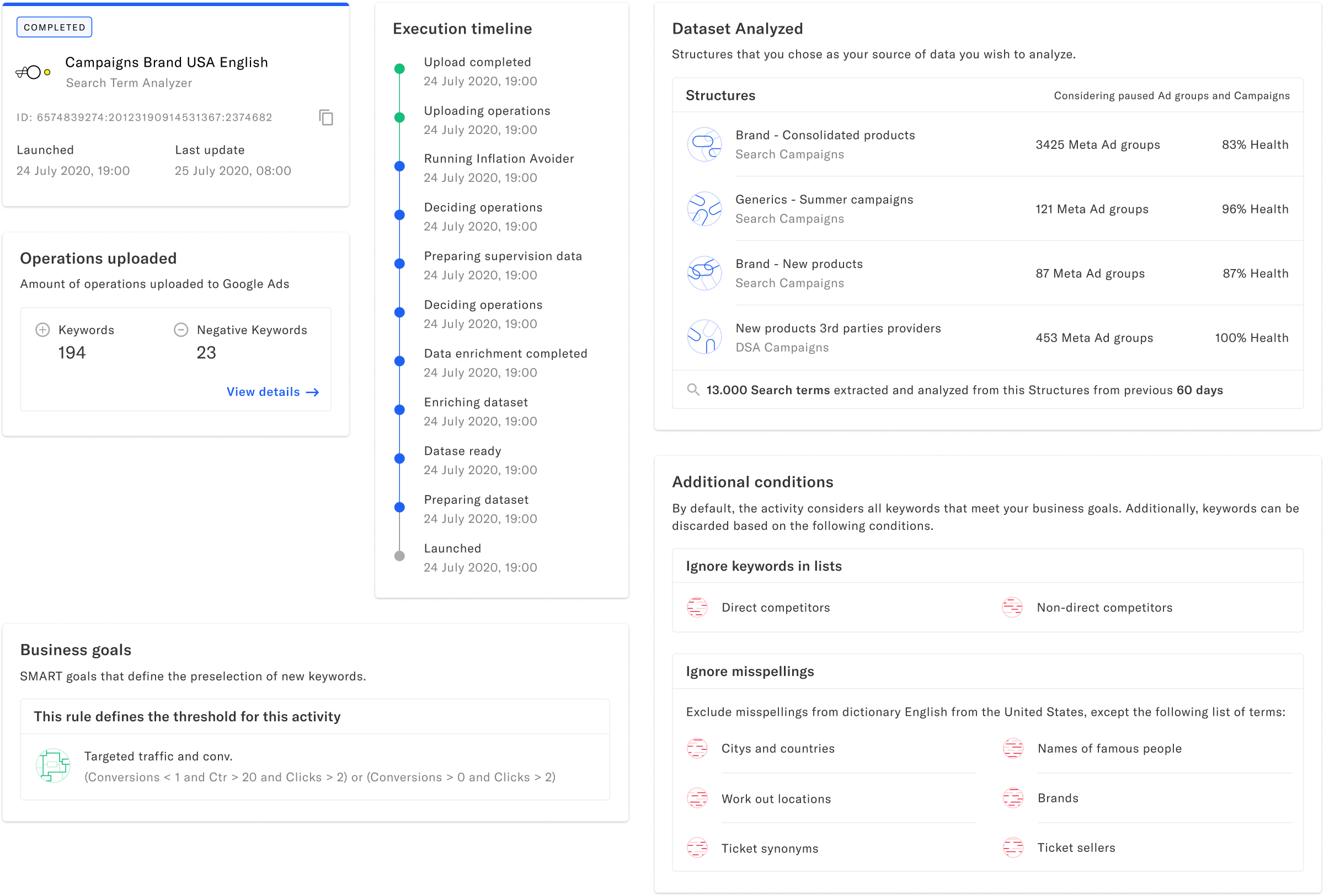
In the Activities view, the user is capable of viewing the currently active and paused activities and pause or activate them. Here, the user can also create new activities for his account and have direct access to all the executions of each activity. This last feature was discovered as essential for SEM managers when they make keyword research in their accounts while setting experimental actions that they want to review one by one.
Since the activities are the ones that carry out the executions shown in the Log, both views are conceptually linked and displayed together in the interface as the primary and most used screens.
In the initial stages of the product, every time the user wanted to create a new activity, he had to set and select all the parameters to create it from scratch. After some tests we realised that, in most cases, they were establishing and using similar parameters for each activity they were creating. It was also a typical comment from the users to being able to use the same group of campaigns to take action on them with different activities along time.
We embraced the idea of having groups of reusable campaigns, and we expand it to those places where we continuously saw the use of similar parameters. In this way, we created our Library of reusable elements: Structures, Rules and Lists. The user now was capable of setting all the activities through different elements that only had to create once.
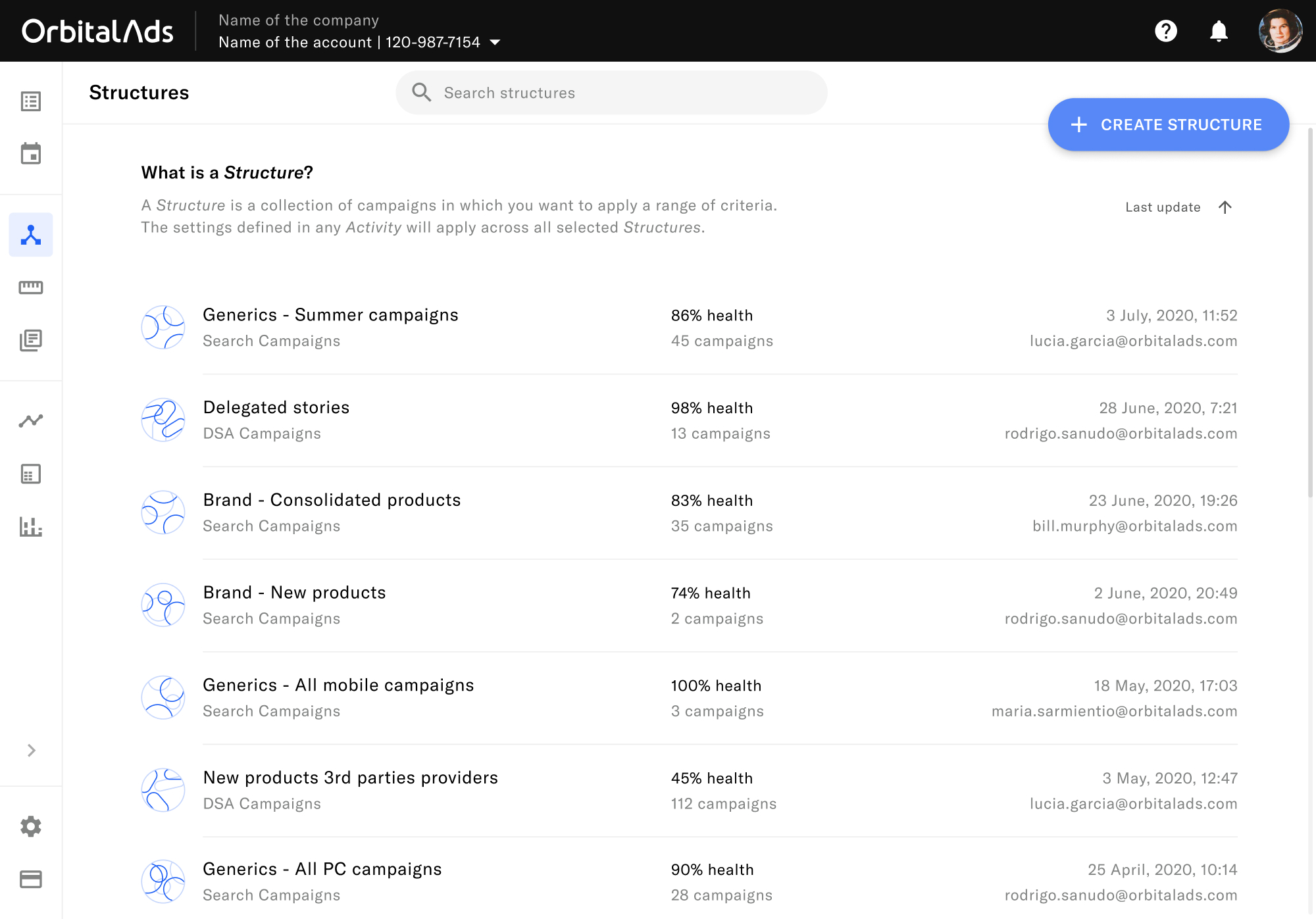
Structures are groups of Campaigns. They are used to extract data from them or to load data to them.
For creating a structure, the user just needs to select the campaigns he wants in that structure.
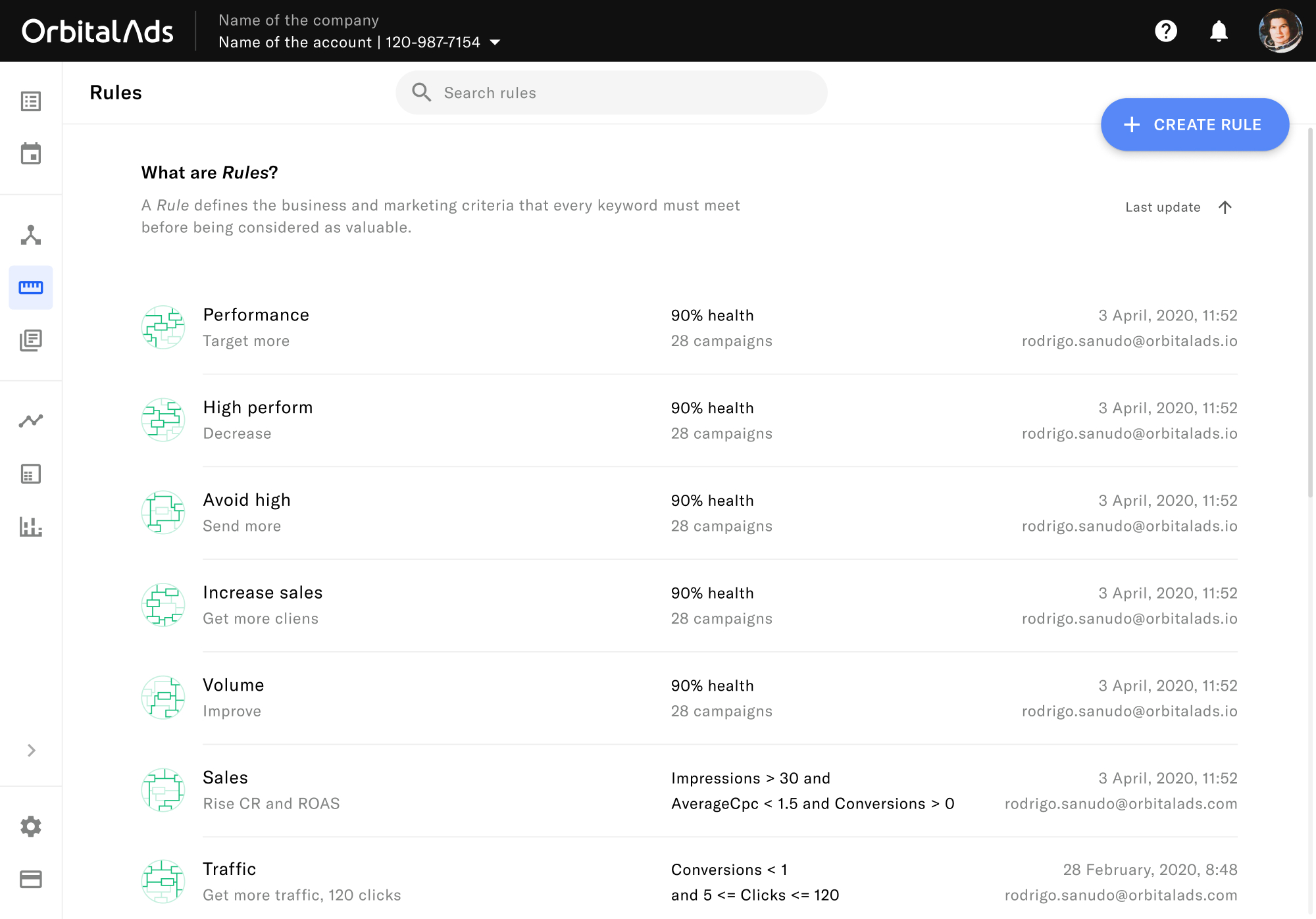
Rules are the objectives and Business goals the user wants to achieve. OrbitalAds activities take this into account to carry out the executions.
Users write from elementary rules to very complex ones. We saw that many users had problems writing valid and complex rules—it was the form with more errors in the entire app. That’s why we provided a rule builder as a complementary way to standard writing. Form errors dropped roughly 50%—we still offered the manual method to writing rules.
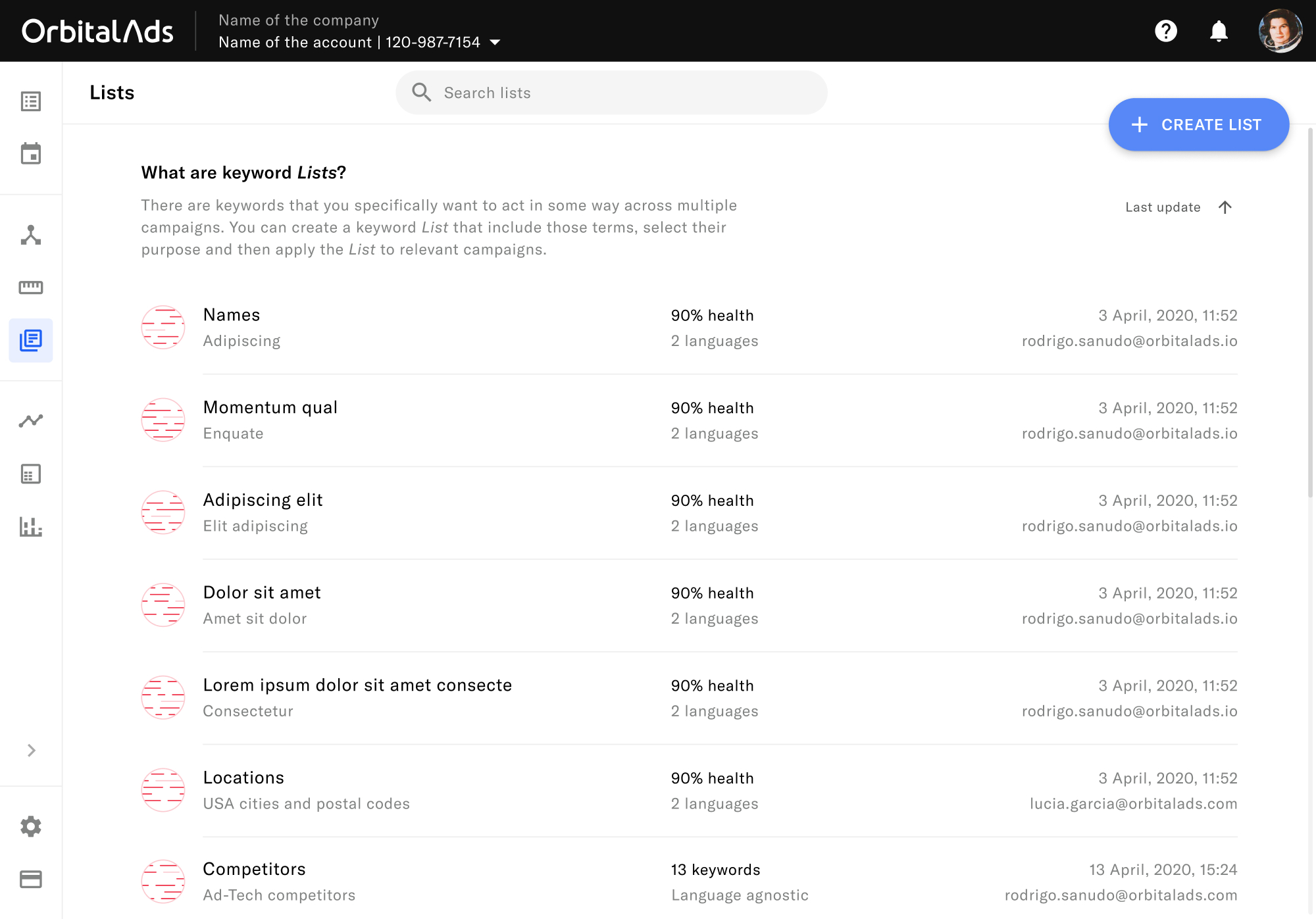
Lists are lists of words or phrases that have special treatment in a Google Search campaign. For example, synonyms, misspellings or competitors’ names.
For creating these lists, the user can write all the terms or upload a file that already contains them.
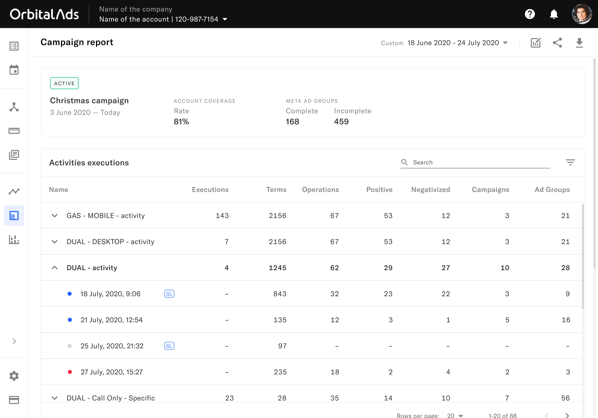
As a first step in the app and following some user interviews to discover which kind of data was valuable for our users, we developed an essential reporting section where we show the actions OrbitalAds activities carry out in our users’ GoogleAds account. It serves as a dashboard to see what is happening in the account.
For the first version, we decided to keep it as a simple action report. We took that decision because the users were able to see and analyse, through automated keyword labelling, all the data regarding the final results and key metrics inside their GoogleAds account. Although it is not ideal, it was a temporary solution as part of the agile development process. For the next iterations of the reporting section, we were working on answering our users’ question: “What exact and measurable value do I get from using OrbitalAds compared with not using it?”
OrbitalAds’ app has been a challenge as a designer from the beginning. Not only because I was the Design Team Lead for the first time, but also because we had to release an entire complex app from scratch. For doing that, we had limited resources, we were working in a niche out of our expertise and with pressure for developing it as fast as possible so that it could be tested and truly validated in the market.
With that in mind, having a user-centric approach has been the key to designing a product that our users value and understand. They are the ones that know more about the complex world of keyword management for Google Search campaigns.
···
Being capable of testing new ideas and concepts as fast as possible in the real interface was one of our big concerns from the beginning. Due to a lack of a significant amount of users and limitation on time, our tests were carried out always in focus groups or individual tests. From this kind of testing, you get excellent data and feedback, but the interface has still to be tested with a large number of users that never used it before.
One of the challenges to address next was that the users understand perfectly the Activities, Structures and Rules. But they don’t understand or don’t know how to use the Lists inside of the system. They think it’s a too complicated concept and most of them don’t use them in the Activities—it is an optional field to use. There is much room of improvement in this concept to provide real value.