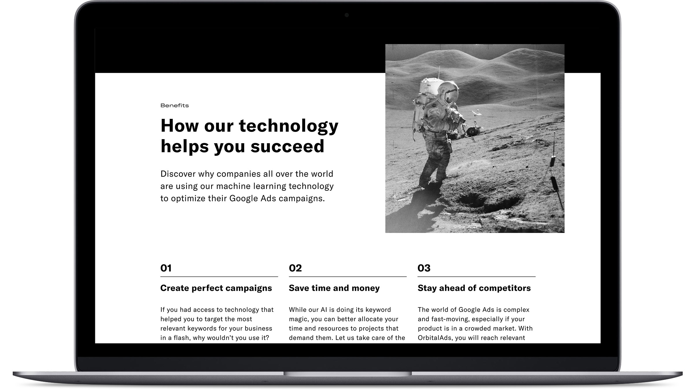
OrbitalAds is a SaaS startup that applies Artificial Intelligence and Machine Learning to Keyword Management in GoogleAds. Its objective is to improve the performance of the GoogleAds account and paid Ad Campaigns while saving time to SEM managers.
OrbitalAds needed to launch a website capable of explaining the product. At the same time, it had to be easy to manage and test by the Marketing team while being memorable and engaging showing OrbitalAds’ brand identity.
My role in this project was Design Lead. I managed a team of four junior designers with a hands-on approach.
I not only established design processes and know-how in the company and managed the growth of the design team, but I’ve also been involved in all the design stages of the project at the same time. From user research and test to prototyping, ideation, writing or final specifications for developers.

We decided to tackle the problem of ever-changing websites and marketing messages, with new landings and requirements, by adopting an approach for the site as if it would be an app. We built a specific design system for the website made by components, sections and page templates. Then, we empowered the marketing team to make decisions on which sections and components to use for trying different messages and creating landing pages.
This approach allowed us to have a lot of control over the design of our website. At the same time, it gave freedom to the marketing team to try new ideas, concepts and formulas continuously—from copy changes to reordering sections, pages or components—having a shallow impact in our development resources focused on building the app.
When building the design system and the visual design, we tried to have a simple and effective design and components, but capable of creating engaging and exciting compositions and moments.
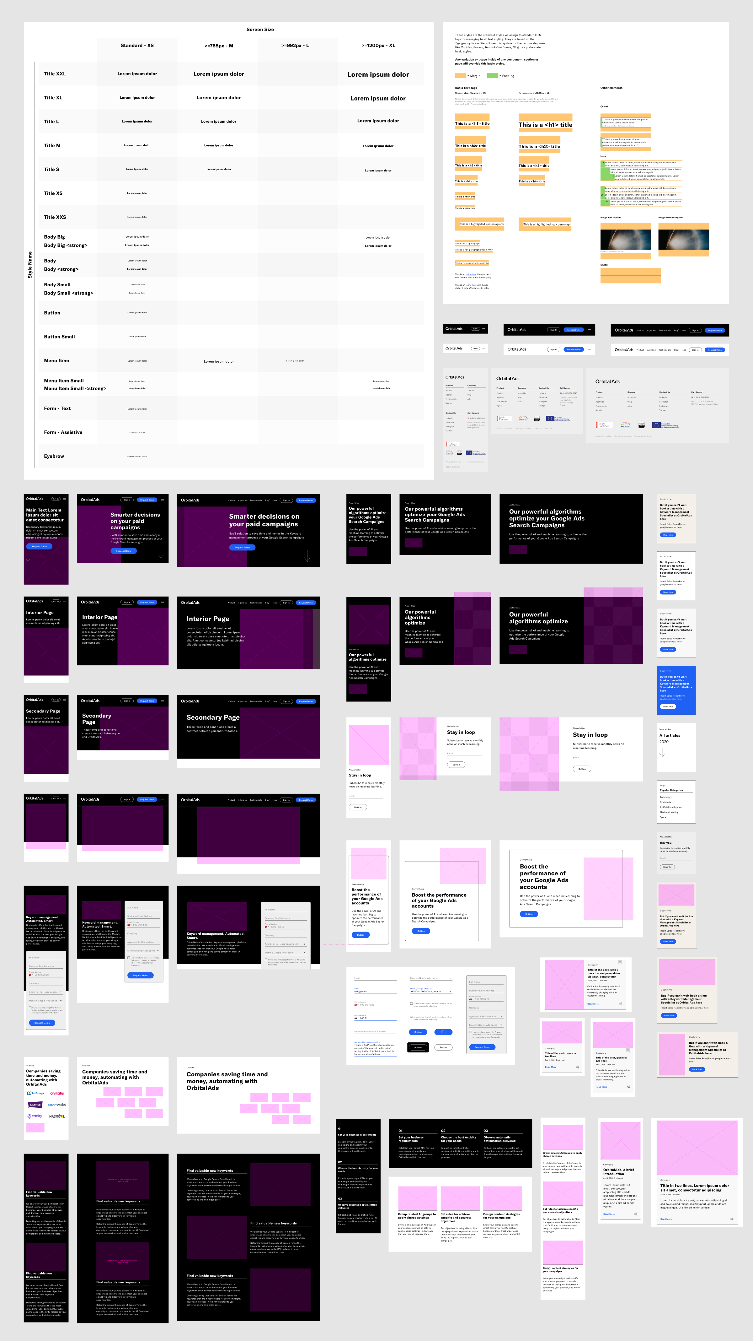
With components and sections ready for every screen size, the system can now work with autonomy. The marketing team can now create and test a huge number of websites, messages, landing pages and articles to tailor the best website for each target.
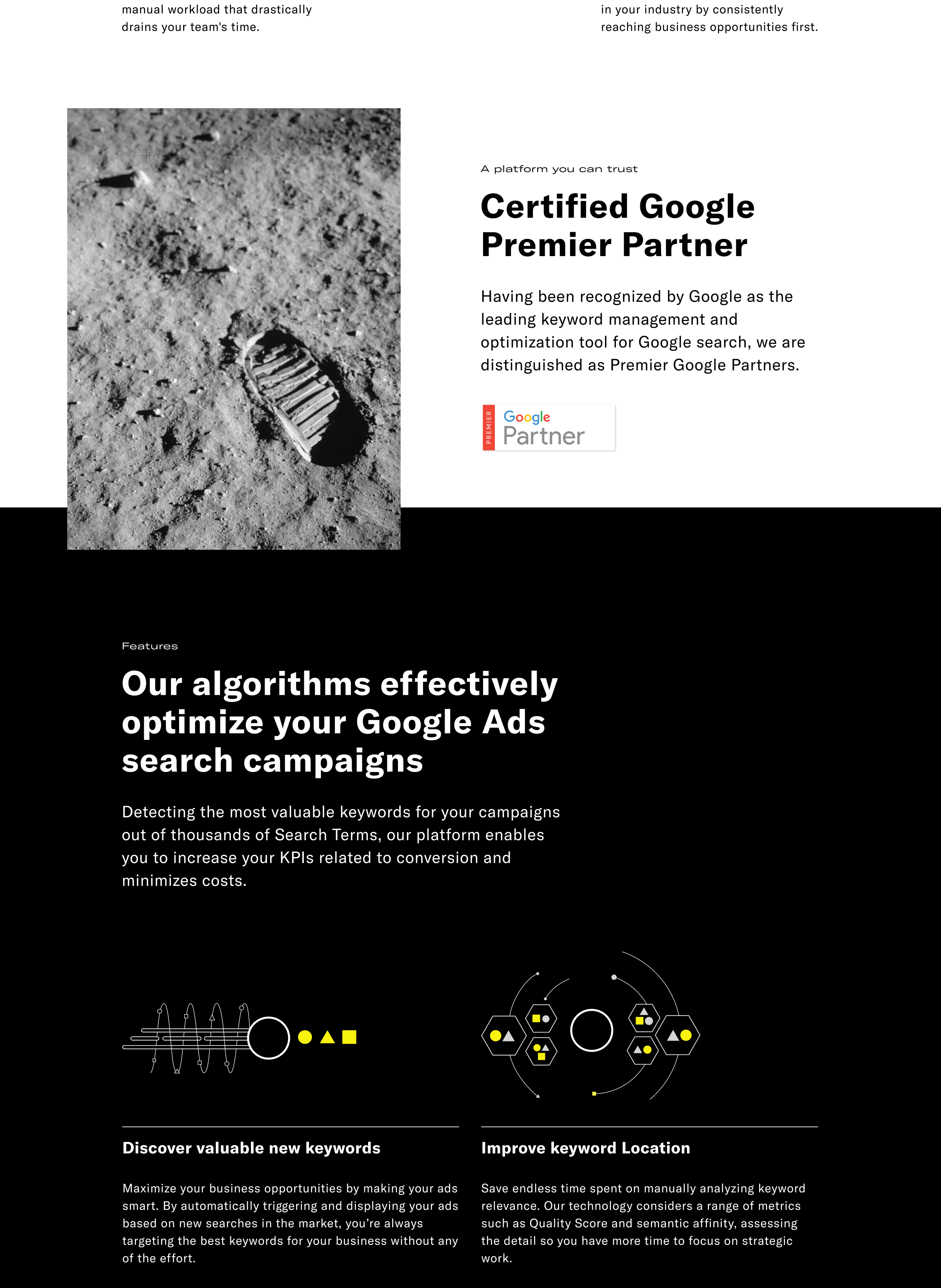
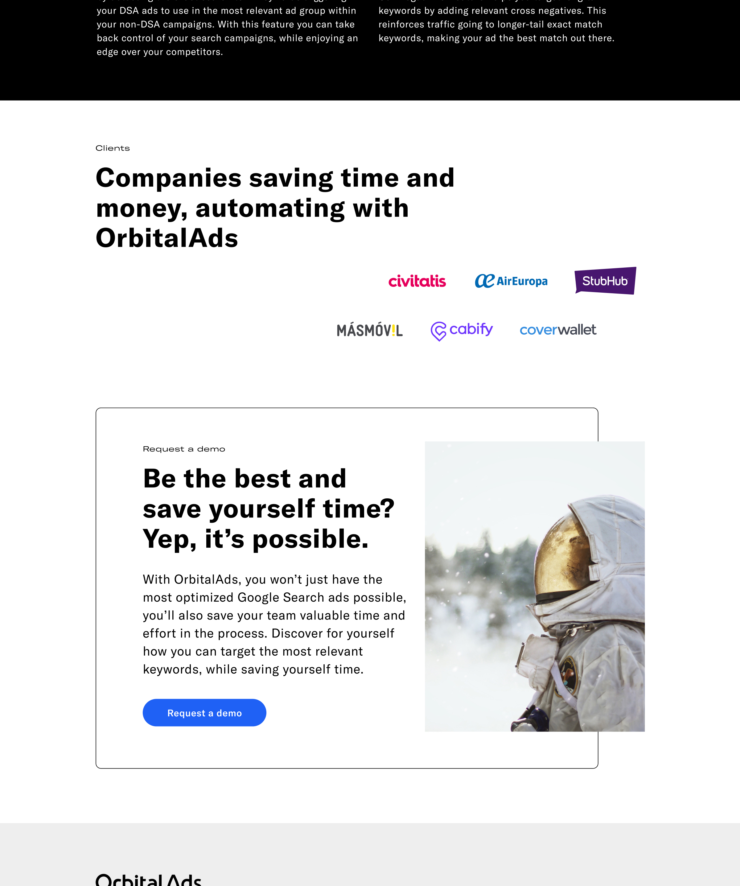
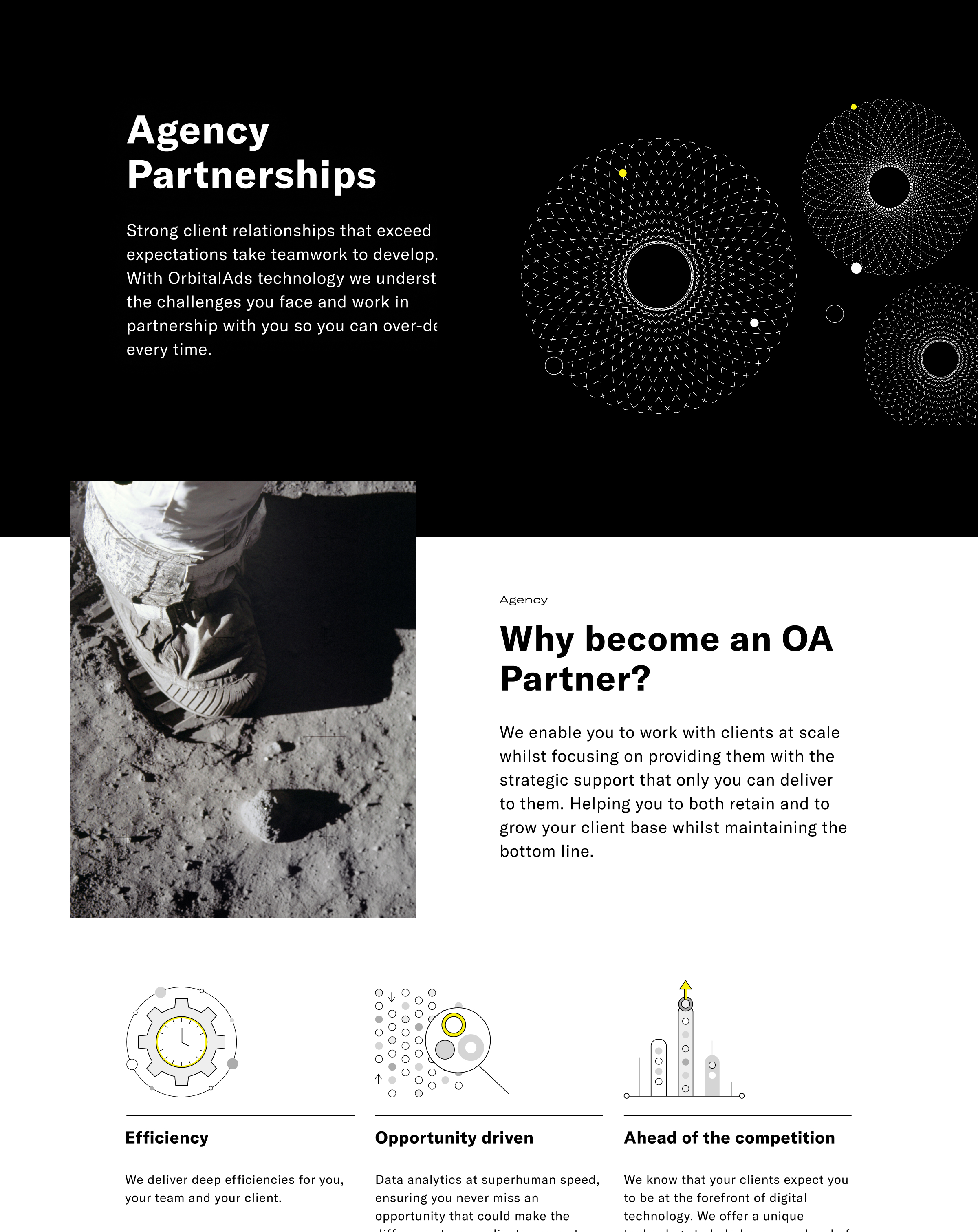
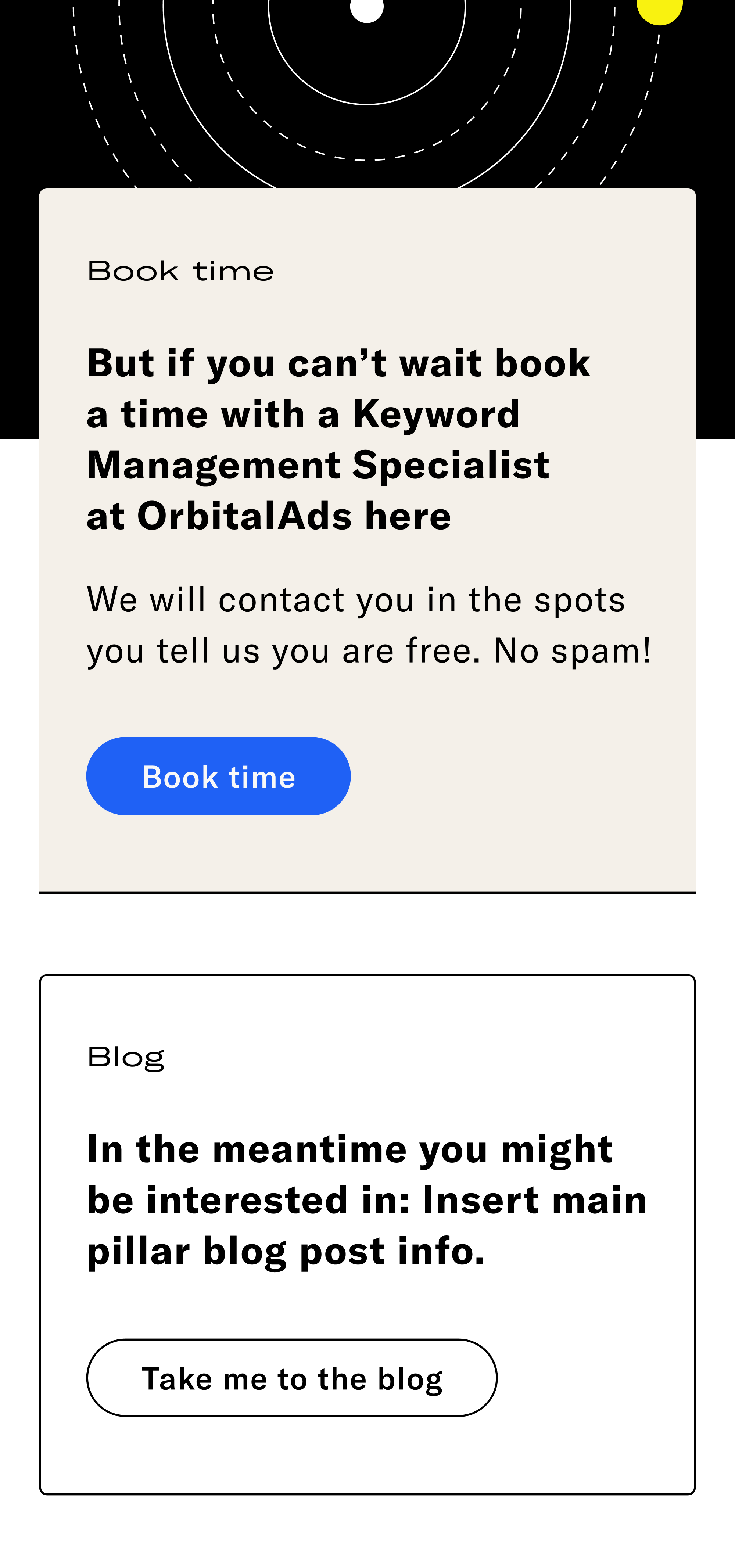
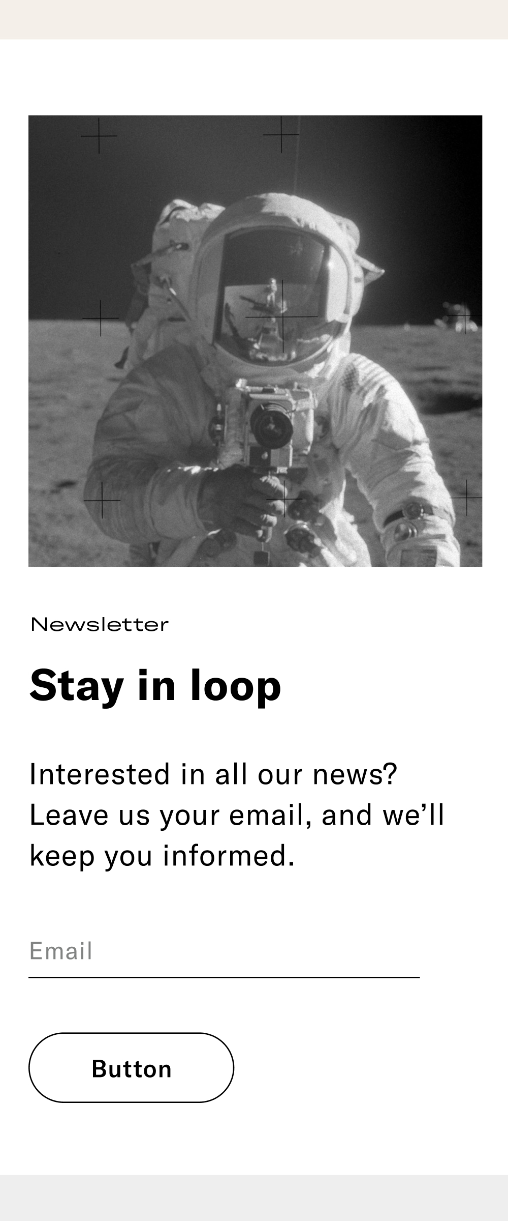
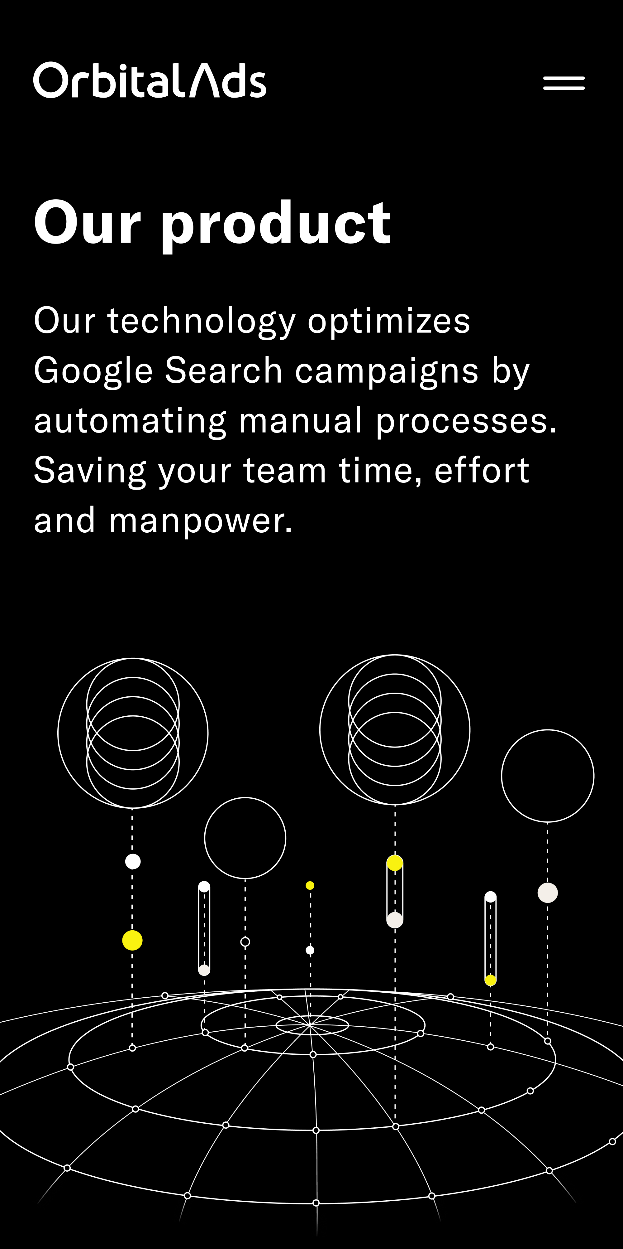
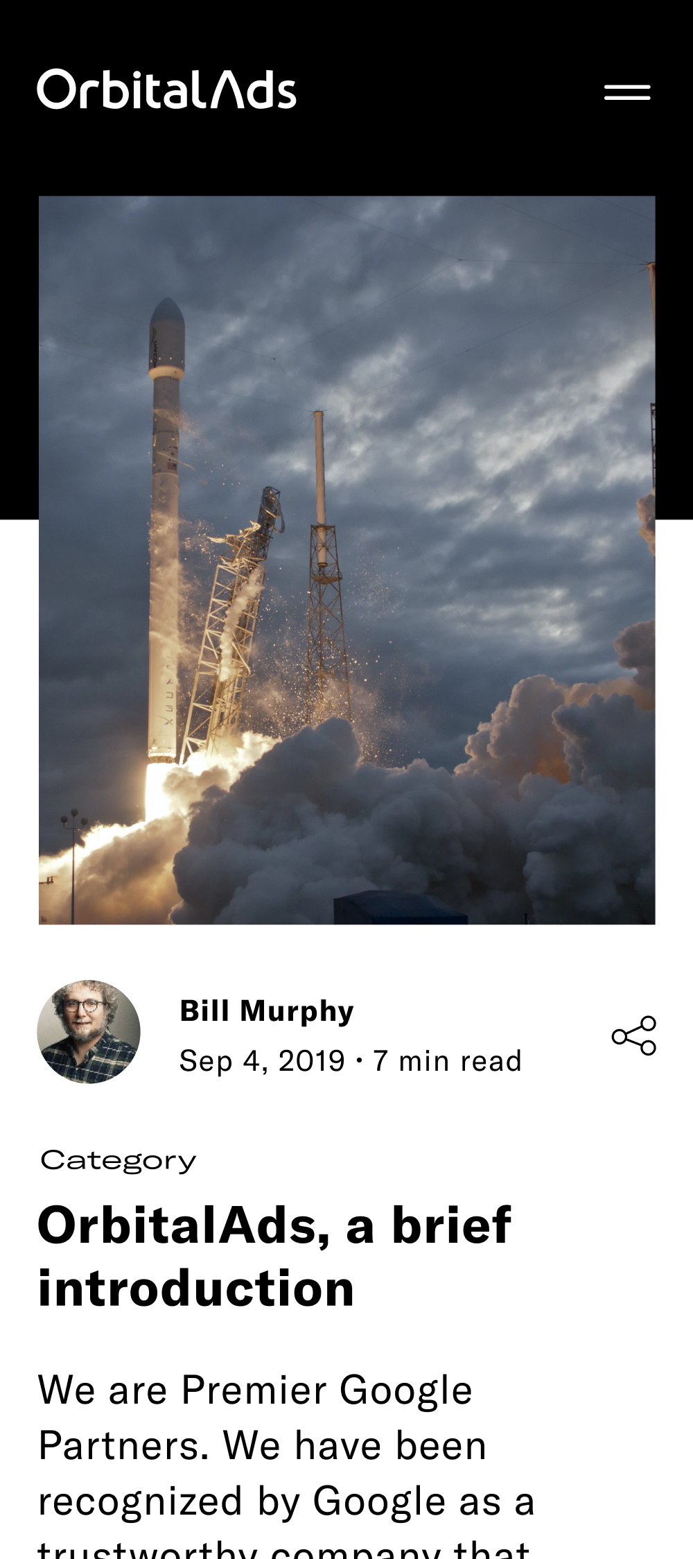
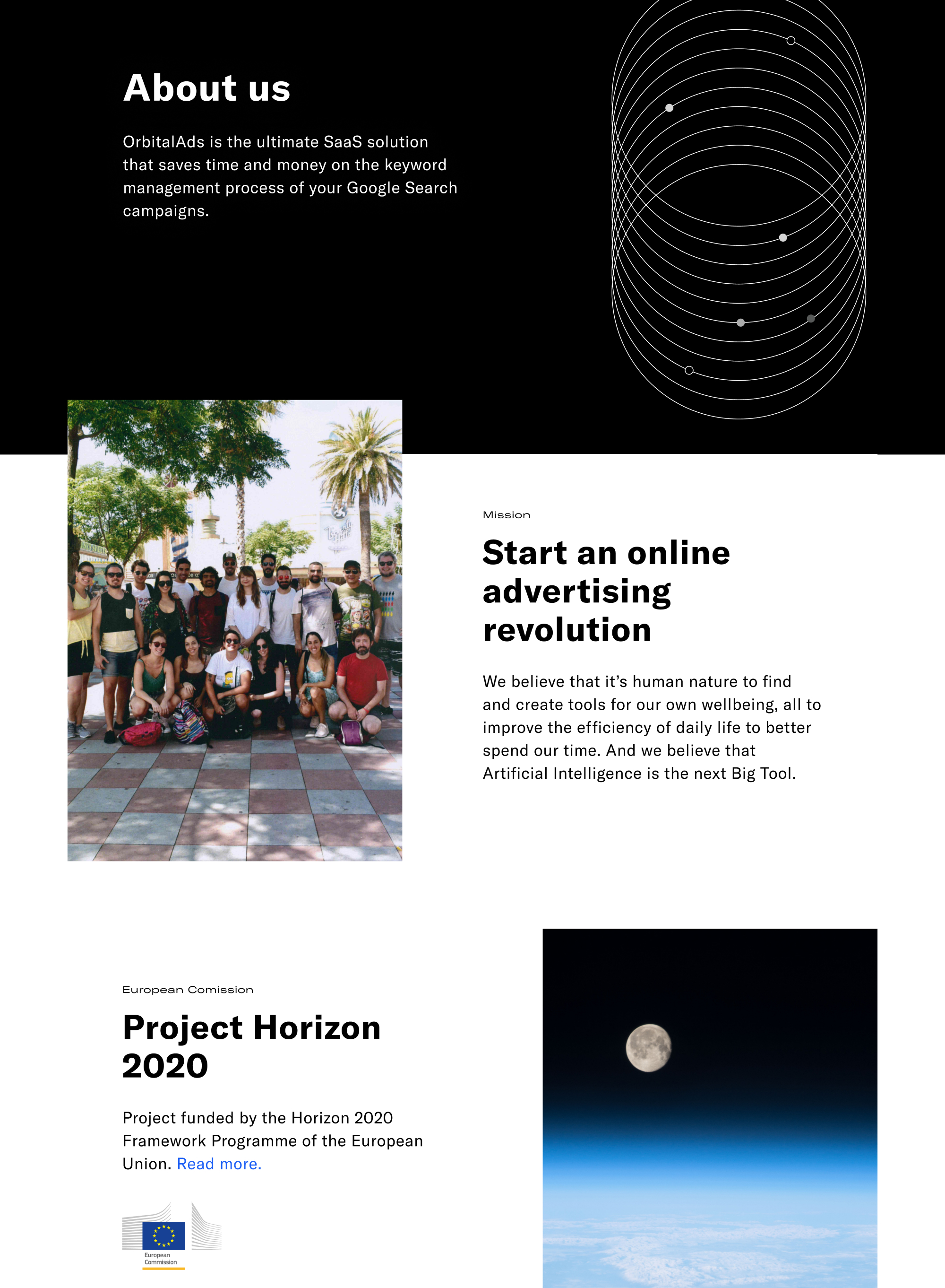
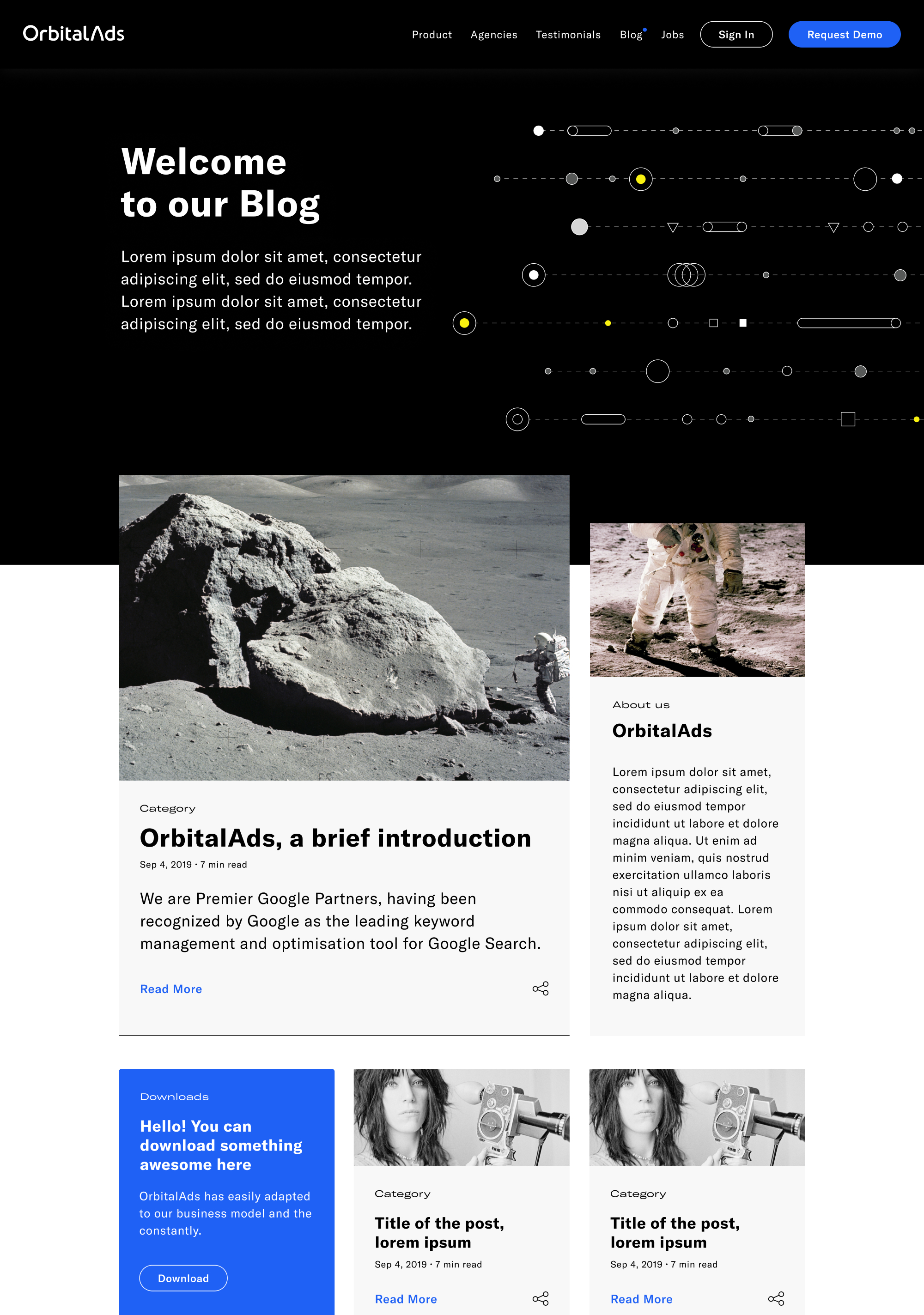
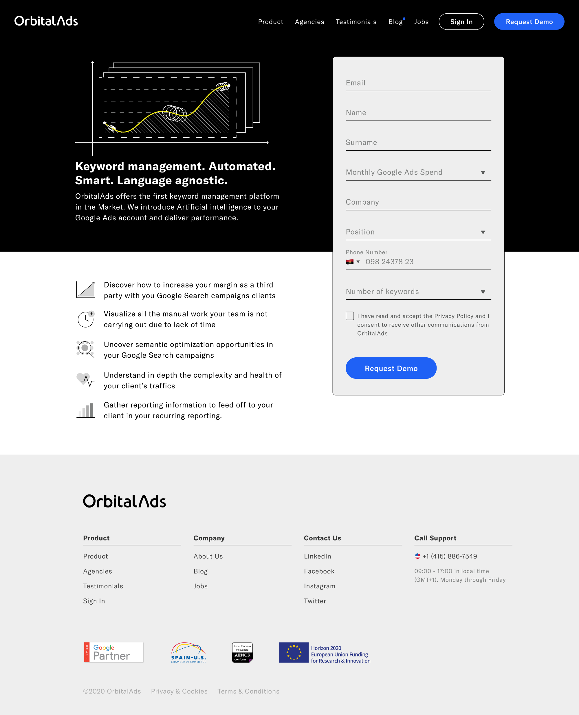
Due to the significant effort, in the beginning, is difficult to make visible how much time and resources you can save when a system is in place. Happily, for this project, it was possible to develop a system for a simple product like a website—simple if we compare it with an app. Putting this system in place allowed our Marketing team to carry out several iterations and tests without any kind of need from design or development. The learnings they had, allowed us to evolve and improve our marketing and sales message in an unmeasurable way.
···
As everything has its counterpart, having two design systems below the same roof, is sometimes challenging. It was not possible to unify these two systems since the app and the website had different needs, purposes and rhythms of evolution. Maintaining two just born design systems with few resources was not always ideal. Being honest, always that we needed to do any trade-off, there was always one side that suffered it. In this case, our website.