Spanish National Orchestra and Chorus’ main website. It promotes classical music from traditional to contemporary perspectives and organises music activities in Spain and around the world.
The project was part of the Spanish National Orchestra and Chorus’ re-branding. The objective was to create all the visual design and interactions of the website, from ideation to prototypes and specifications for developers. The team had to work with an external development company, which was responsible for delivering the wireframes and structure of the page.
Project developed at underbau.
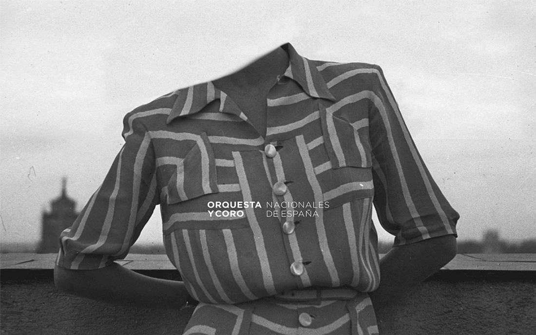
© «Desconocidas» series, Noé Sendas.
© «Wilder Man» series, Charles Fréger.
I was part of the team that worked on the Orchestra’s re-branding project that included all the company’s materials and touch points. Nevertheless, I was the lead and main responsible for its creation and implementation on the digital side. This side included the design of the website.
In an iterative approach, I created all visuals, interactions, prototypes and final specifications for developers. All this material was built at the same time with the new brand, and both parts influenced each other continuously.
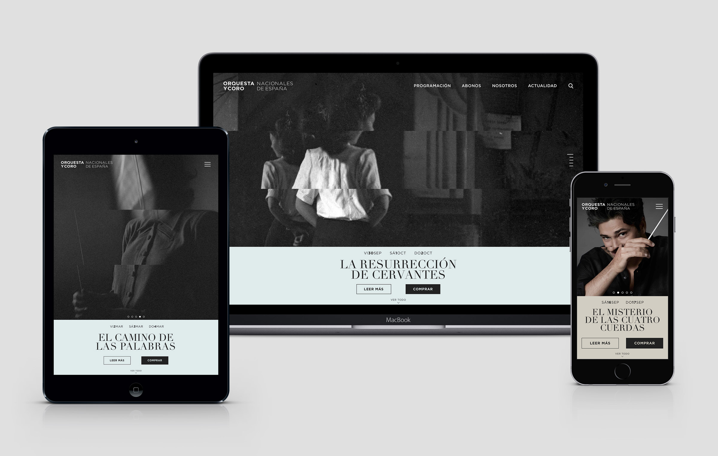
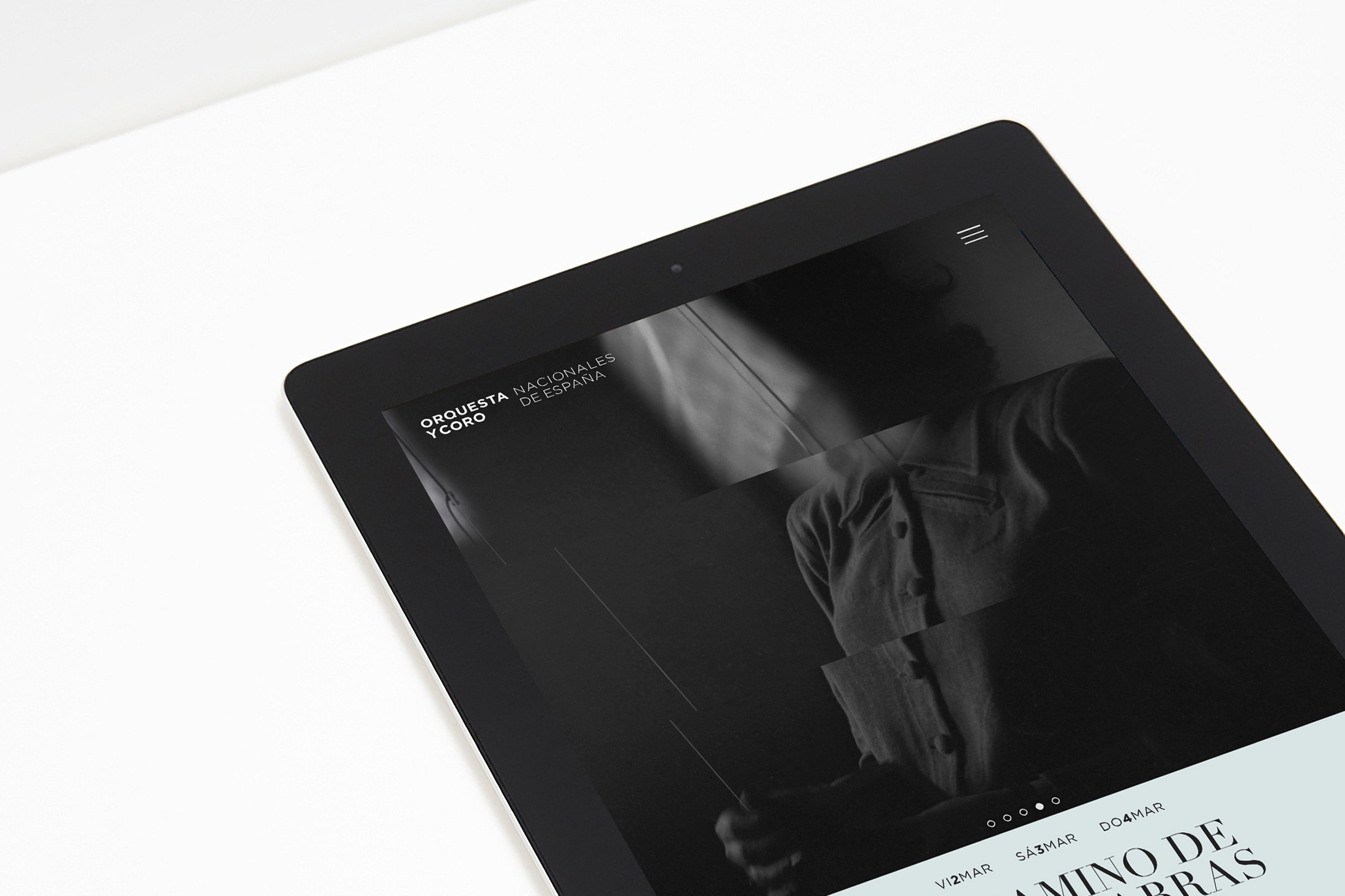
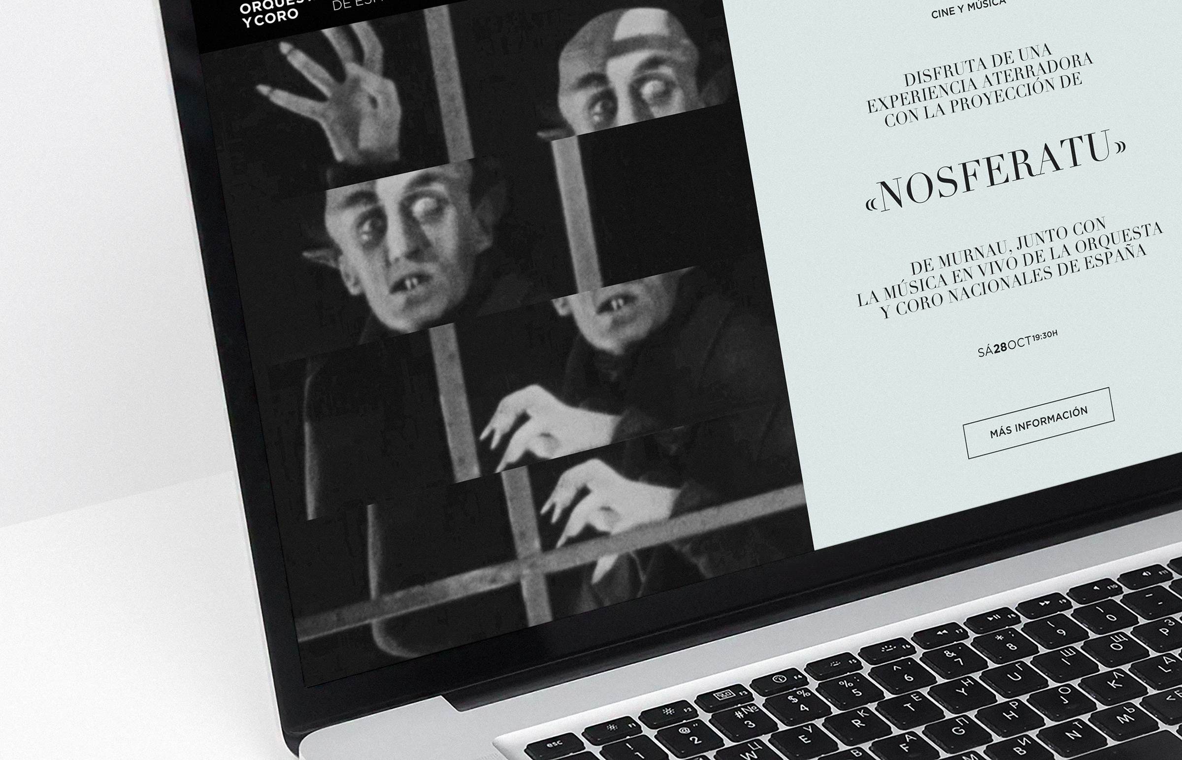
The stave is the central element of the Orchestra’s identity. We cut and divided an image in four pieces to display it. The website uses this visual construction in the Home’s Hero Section as the most visible and characteristic element of it.
The challenge with this interaction was to be capable of maintaining the visual effect that worked well in printing material in the digital media. It was necessary to communicate the contemporary and quality feeling of it without falling into the cheap carousel transition effect that characterises many common web templates.
I did several prototypes to explore and achieve the final result. The prototype on the right side is of the examples discarded. In this example, the moment in which the image is cut is a state in-between that makes the stave invisible and the transition a decorative effect. In contrast, the final interaction shows that the in-between state is the standard image. The interaction cuts the image with a clear purpose in different pieces to show the stave.
Since the interaction with carousels in touchable devices has a different nature, the effect provided in these devices had to change.
Due to lack of space, the image in the carousel for small devices was cut only in two parts, as a zoom-in in the stave. We set a fallback with the cute image for low-performance devices.
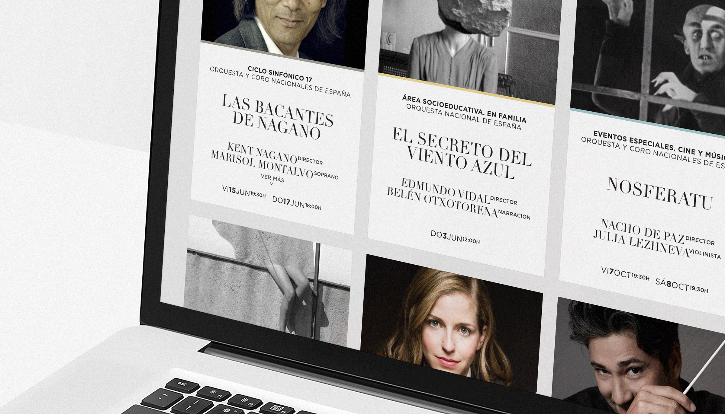
The main objective of the website was to show the events the Orchestra organises and sell its tickets. The list of these events was added in the form of cards with a Load More button so that its exploration allows the user to see more events at the same time. This button also gives the user control over the moment the new events are loaded.
The card system includes a colour differentiation for the four main categories of the events and a shortcut for reducing friction when buying tickets. The card system also includes a simplified version to be used with news and events.
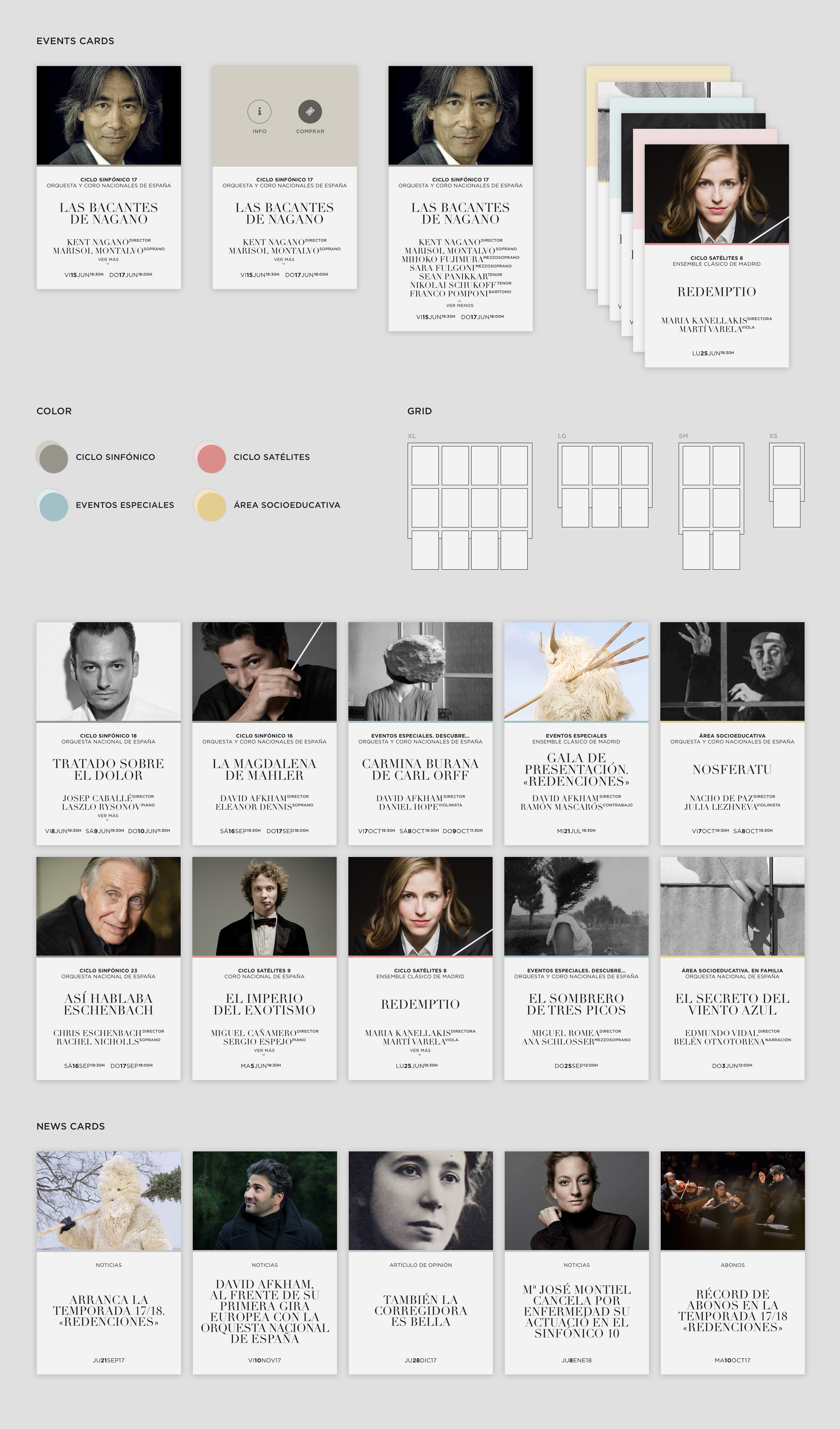
The card shows the information of the two principal artists that play in the event. Since a lot of users were interested in know other secondary artists, clicking in View More shows a more completed list.
Due to the long names of some artists and their roles, we used a superscript to show the role of each artist as the Roman Numeral Analysis of music.
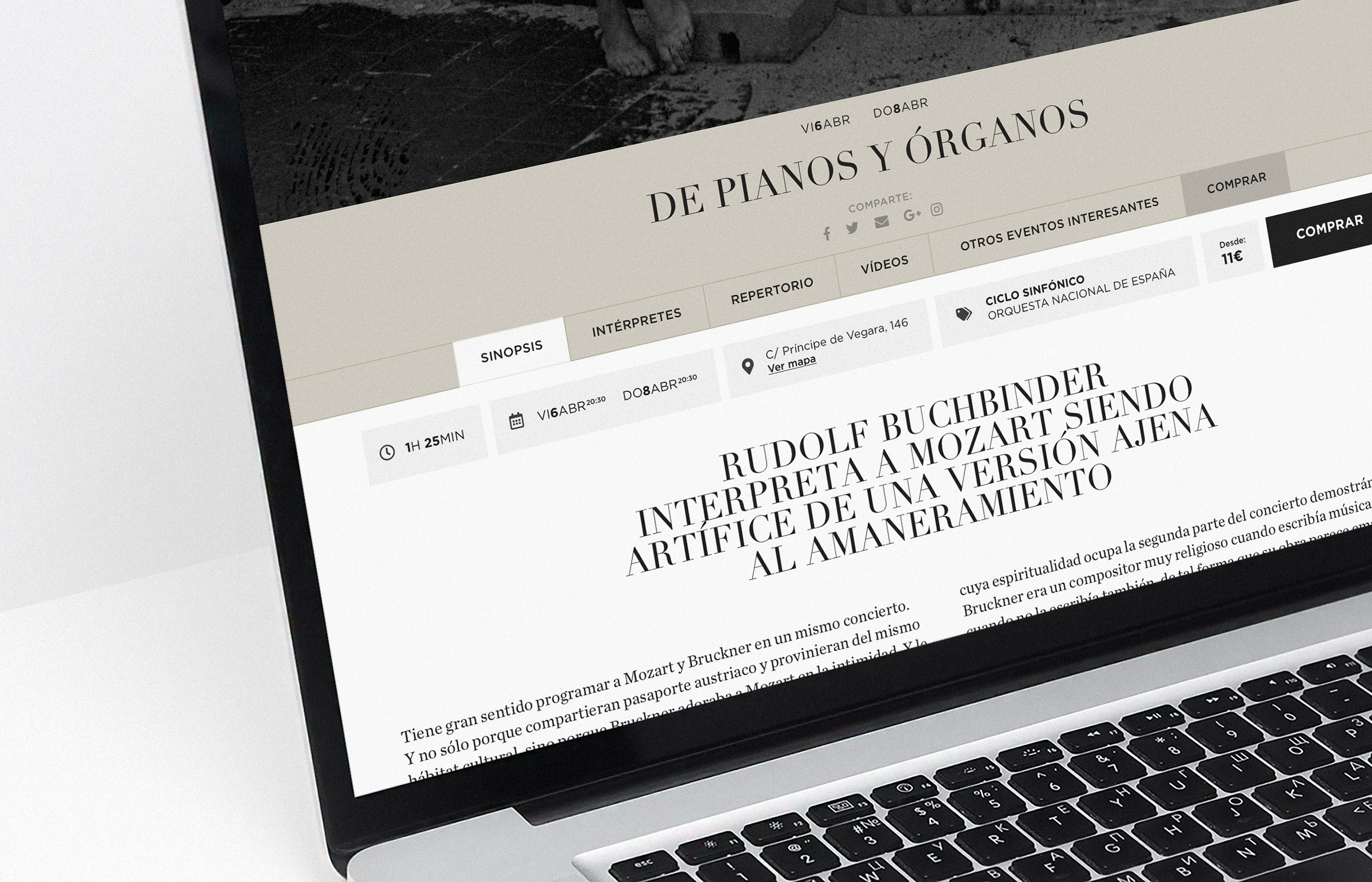
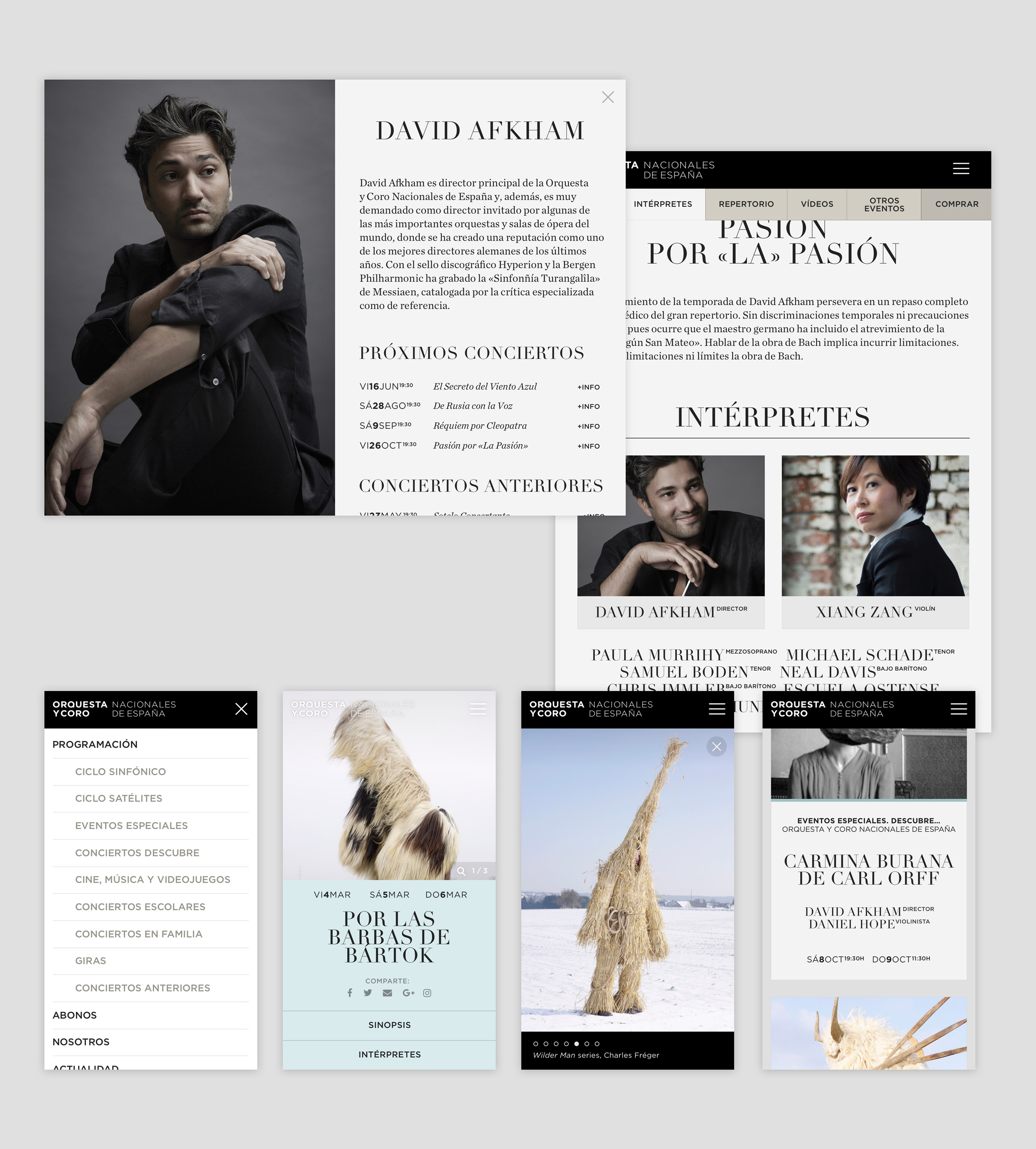
Each event’s detail page had to include a way for exploring images related to that event. These images were crucial for activities that were focused on children and to promote special events in which a unique performance was going to happen.
A significant amount of users showed the will of knowing more about the artists that were going to take part in the event before buying a ticket. We added a preview of the information of the artists inside the event page. With this solution, the user doesn’t need to leave the page of the event where they can buy the tickets.
In mobile devices, user testing showed us that the amount of information inside one event made our users feel lost in the content. We created an accordion so that the users can access the desired information easier and faster.
The most valuable lesson I learnt from this project was how important it is to have clear and close communication with all the stakeholders involved in the process to bring the project into reality. Specifically in this project, with the developers. The reason for this is that, since the project was inside a public contract and the client was working as the intermediary, we never had the chance to discuss and improve the design with the developers. And neither they had the opportunity to solve any doubt or concern they could have about the specifications and prototypes with us. Also, we didn’t have any chance of reviewing the state of the website while or after they were developing it. These factors were crucial at seeing the final result and implementation of the project as not successful from a design quality perspective.
This project was an inflexion point for me regarding how to manage the production of a project and the relation I have with developers. I believe that this relation should be always open, transparent and with continuous feedback in both directions.
···
One area of the website that, in my opinion, needs to be improved is the event page. Being more precise, the position and visibility of the Buy Button. It would be the first thing I would try to improve, measuring and trying different options. To buy tickets is the primary action on the event page—and the main objective of the website—and the CTA inside of the colour band could be not visible enough for the users. Additionally, the black button inside of the content of the first section is not easily actionable. In mobile devices—with the accordion—this mistake is more visible and relevant, making the black Buy Button go unnoticed if the user does not tap to show the first section.